Update to 0.7.0
-
@tonyshowoff said:
God almighty, the new style sheet is terrible, what's with this layout?
Yep. Please join the NodeBB dev team and give them some better direction. Haha
-
I do wish the Reply and quote button where on the bottom of the post on the right hand side.
I do have to say
THANK YOU to whomever decided to use the three stacked dots instead of the bloody hamburger menu.
-
@thecreativeone91 said:
Yep. Please join the NodeBB dev team and give them some better direction. Haha
I'm a whore, but an expensive one
-
@JaredBusch said:
Clicked on the link to jump to the end of the what are you doing now thread on my ipad
Here was the result: https://instagram.com/p/3PBcWtQ3Ia/
the browser history is nothing but a bunch of refreshes
Sounds similar to the issue I described here.
-
It seems like all they cared about is the mobile version so the main site is now horrendous. And the mobile version while better isn't working.
-
@Dashrender said:
I do wish the Reply and quote button where on the bottom of the post on the right hand side.
I do have to say
THANK YOU to whomever decided to use the three stacked dots instead of the bloody hamburger menu.
Isn't that just a skinny hamburger?
-
@scottalanmiller said:
@Dashrender said:
I do wish the Reply and quote button where on the bottom of the post on the right hand side.
I do have to say
THANK YOU to whomever decided to use the three stacked dots instead of the bloody hamburger menu.
Isn't that just a skinny hamburger?
Since we're applying food names to items which vaguely have the same shape, why not call it a fish stick or french fry menu?
-
@scottalanmiller said:
@Dashrender said:
I do wish the Reply and quote button where on the bottom of the post on the right hand side.
I do have to say
THANK YOU to whomever decided to use the three stacked dots instead of the bloody hamburger menu.
Isn't that just a skinny hamburger?
Veggie-bruger icon?
-
Fish Fingers!
-
-
@thecreativeone91 said:
It seems like all they cared about is the mobile version so the main site is now horrendous. And the mobile version while better isn't working.
Sounds like my approach, if one half of people are complaining, make it to where everyone hates it.
-
@tonyshowoff said:
@thecreativeone91 said:
It seems like all they cared about is the mobile version so the main site is now horrendous. And the mobile version while better isn't working.
Sounds like my approach, if one half of people are complaining, make it to where everyone hates it.
At least there is consistency then?
-
@scottalanmiller said:
@Dashrender said:
I do wish the Reply and quote button where on the bottom of the post on the right hand side.
I do have to say
THANK YOU to whomever decided to use the three stacked dots instead of the bloody hamburger menu.
Isn't that just a skinny hamburger?
I can't tell if you're being serious or funny
-
@Dashrender said:
@scottalanmiller said:
@Dashrender said:
I do wish the Reply and quote button where on the bottom of the post on the right hand side.
I do have to say
THANK YOU to whomever decided to use the three stacked dots instead of the bloody hamburger menu.
Isn't that just a skinny hamburger?
I can't tell if you're being serious or funny
Why can't I be both?
It IS just a skinny hamburger, right? The lines just aren't very wide.
-
@scottalanmiller said:
@Dashrender said:
@scottalanmiller said:
@Dashrender said:
I do wish the Reply and quote button where on the bottom of the post on the right hand side.
I do have to say
THANK YOU to whomever decided to use the three stacked dots instead of the bloody hamburger menu.
Isn't that just a skinny hamburger?
I can't tell if you're being serious or funny
Why can't I be both?
It IS just a skinny hamburger, right? The lines just aren't very wide.
Nice.. I suppose you can be..
None the less.. I still like the dot, and hate the lines.. I can't explain why.
-
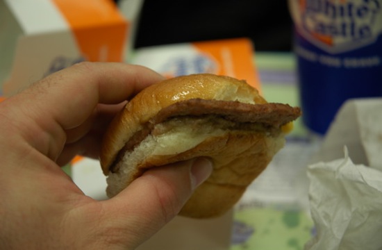
Wouldn't a skinny hamburger be a slider?
-
@Reid-Cooper said:
Wouldn't a skinny hamburger be a slider?
No, it'd just be wrong.
Sliders are fat juicy mini burgers.
-
I've never heard White Castle or Krystal described quite that way.
-
@Reid-Cooper There is "technically incorrect but delicious" and there is full stop incorrect.
-
@MattSpeller said:
@Reid-Cooper There is "technically incorrect but delicious" and there is full stop incorrect.
